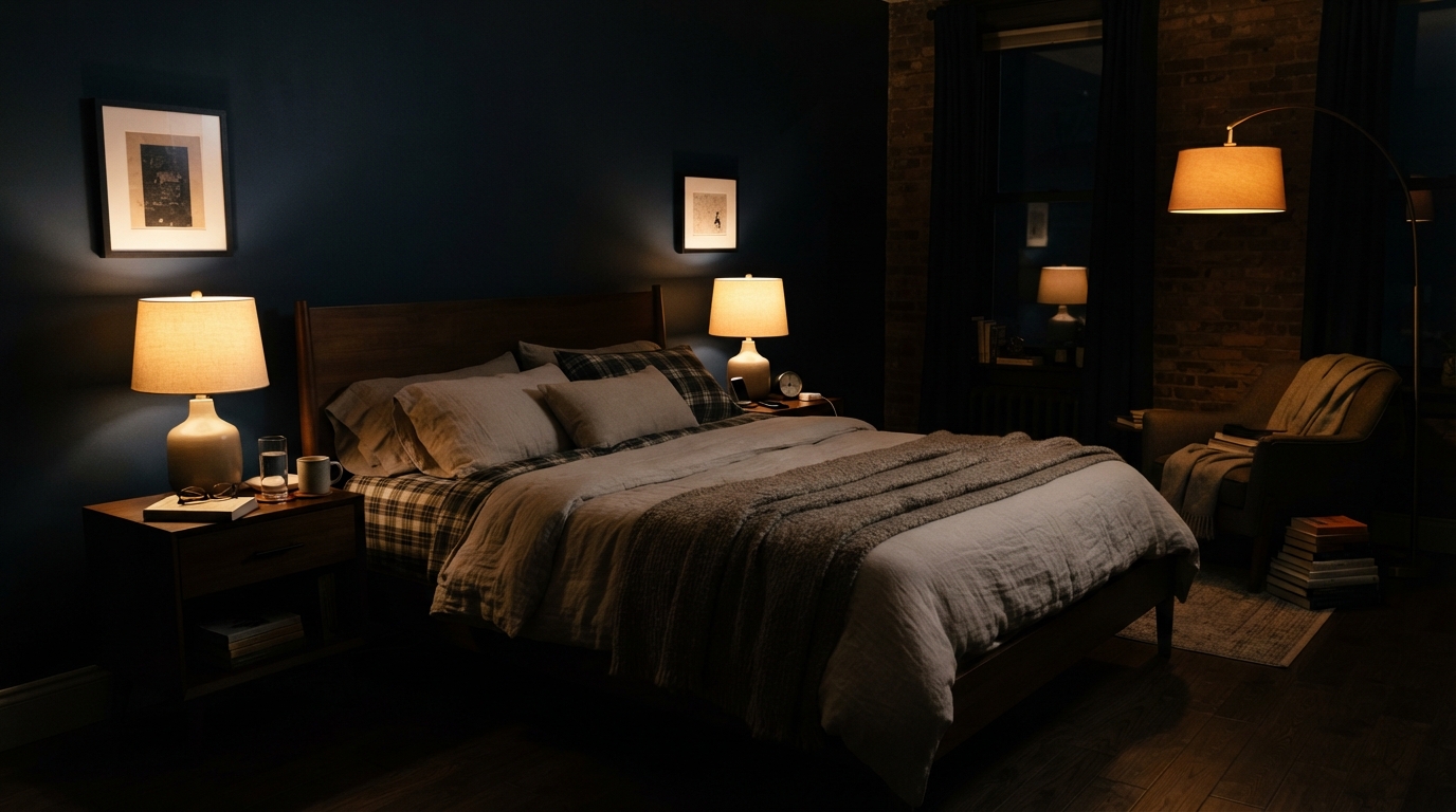
A few years back I went with a deep slate-blue on my bedroom walls, and my sister was convinced I’d regret it. “You’re going to feel like you’re sleeping in a closet,” she told me. I get why people react that way — dark paint has a reputation. But when she stopped by a month later and found the room lit by a pair of amber-toned lamps, a wool throw folded over the footboard, she didn’t mention the closet comment again. She asked where I bought the paint.
That’s the whole appeal of moody bedroom design: it reads as a gamble until you actually stand in the finished room, and then it just makes sense.
This article breaks down what actually makes a dark bedroom feel inviting rather than closed-in — from the colors worth considering to the small lighting decisions that make or break the look.
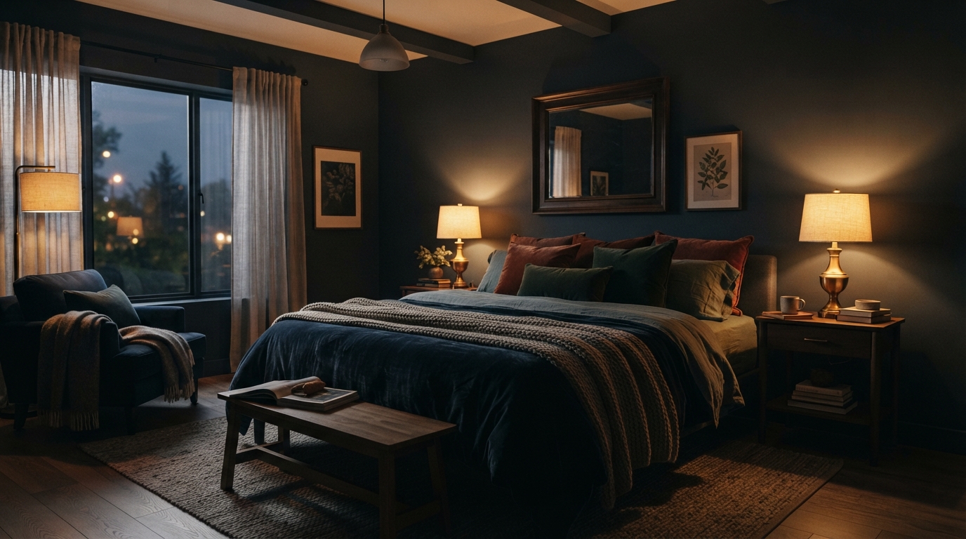
1. What Does “Moody Bedroom” Actually Mean?
The word “moody” makes people picture something gloomy, but the aesthetic is built on the opposite idea. It pairs rich, saturated wall colors — ink, charcoal, plum, deep green — with soft, touchable materials and low, warm-toned lighting. Done well, the room feels like it’s holding you rather than closing in on you.
The mistake most people make is assuming moody just means “dark paint.” Paint is only the starting point. What separates a room that feels curated from one that feels like an unfinished basement almost always comes down to two things: texture and light source, not the color itself.
2. Deep Paint Colors Worth Considering
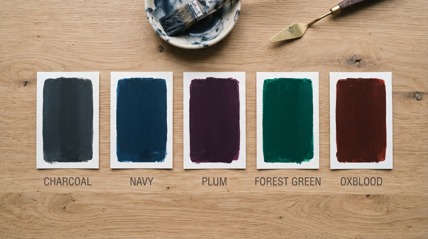
A handful of shades show up again and again in well-executed moody bedrooms, and each brings something different to the room:
- Charcoal and near-black neutrals — a soft charcoal reads warm-grey during the day and shifts to near-black at night, which gives the room two different personalities depending on the hour.
- Deep navy — dark enough to feel dramatic, but it still registers as a color rather than an absence of one, so the room doesn’t lose its shape.
- Aubergine and plum — striking and a little theatrical; best for someone who wants the walls to be a genuine statement rather than a backdrop.
- Forest and hunter green — brings a cabin-like, grounded feeling that tends to work especially well in colder months.
- Oxblood and burgundy — a less common choice that’s gaining traction, particularly when it’s paired with warm brass fixtures.
None of these are colors you’d call “safe.” That’s more or less the entire point of the style — it trades the usual beige-and-greige playbook for something with more presence.
3. Picking a Wall Color Without Shrinking the Room
This is the question that comes up most: won’t dark walls make a small bedroom feel even smaller? To some degree, visually, yes — but there are a few reliable workarounds.
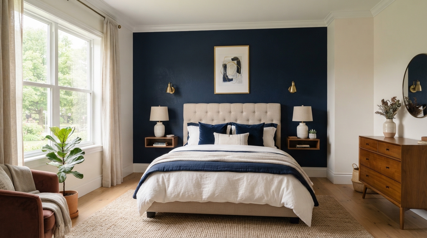
Keep the ceiling a lighter shade, ideally white or off-white, so there’s still somewhere for the eye to travel upward. Natural light plays a bigger role than most people expect, too — a room with generous windows can handle a more saturated wall color than a room with one small, north-facing one. If your space doesn’t get much direct sun, either go a shade or two lighter than your first instinct, or limit the deep color to a single wall, usually the one behind the headboard.
One detail that’s easy to overlook: sheen matters almost as much as hue. A satin or eggshell finish bounces noticeably more light than a flat matte version of the exact same paint color, so the same charcoal can read as heavy or as balanced depending purely on the finish you choose.
4. Using Texture to Soften Dark Walls
Dark walls on their own can start to feel flat and a little cold. Texture is what keeps that from happening, and honestly it does more heavy lifting than color choice.
Velvet is the most obvious pick — a velvet headboard or even a handful of velvet cushions adds warmth almost instantly. Linen brings a relaxed, slightly undone quality that keeps a dark room from feeling overly formal. Bouclé, the nubby, looped fabric that’s become a fixture on design boards, works well on a single accent chair. And a heavy knit or wool throw across the foot of the bed earns its place twice over — it looks good, and it’s genuinely warm on a cold night.
Aim for at least three distinct textures in the room. A dark, single-texture space is usually what makes people describe the look as harsh instead of cozy.

5. Layering Bedding for a Lived-In Look
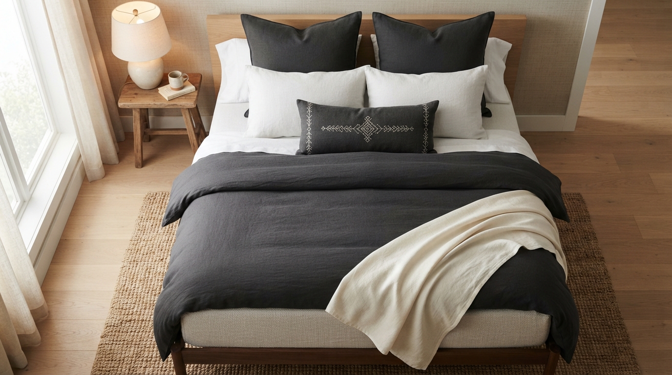
Bedding is where the “layered” part of moody design really shows up. Start with a base layer — a duvet in either a deep tone or a soft neutral — then build outward: a textured throw folded at an angle, a couple of oversized pillows, and one smaller accent cushion in a contrasting fabric or pattern.
Resist the urge to match everything exactly. A charcoal duvet next to a slightly different shade of grey linen pillow tends to look more considered than a perfectly coordinated three-piece bedding set. It sounds counterintuitive, but bedding that matches too precisely often reads as a hotel room rather than someone’s actual bedroom.
6. Lighting: Where Most Moody Bedrooms Go Wrong
This is the single biggest factor in whether a dark room feels warm or feels like a cave, and it’s the part people skip most often. You can nail the paint color and the textiles and still end up with a cold, uninviting room if the light source is wrong.
Avoid relying on an overhead fixture, especially one with a cool-white bulb — that combination is genuinely rough against dark walls. Go for warm-temperature bulbs, somewhere around 2700K, in a couple of table lamps, a floor lamp tucked in a corner, or a small sconce mounted near the bed. Two or three lower, warmer light sources at different heights will always outperform a single bright ceiling light.
If you’ve been putting off a moody redo purely because you’re worried about the room feeling dark and unwelcoming, swapping in warm bulbs alone solves most of that concern before you even touch the paint.
7. Curtains That Add Drama Without Overpowering the Room
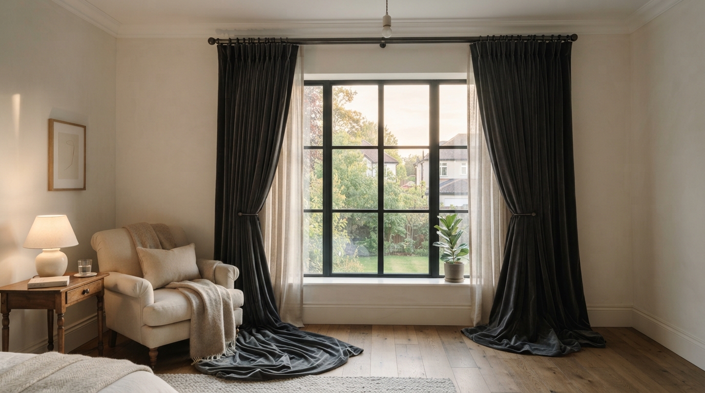
Floor-to-ceiling curtains do a lot for this style, even in a smaller room. Heavier fabrics — velvet or a dense linen — pool slightly at the floor, which reinforces the soft, dramatic quality that defines the look.
Choose a curtain shade a touch lighter or darker than the wall rather than matching it exactly, and mount the rod higher than the window frame itself. It’s a small adjustment, but it visually raises the ceiling and offsets some of the visual weight a dark wall naturally carries.
8. Furniture That Works With Deep Tones
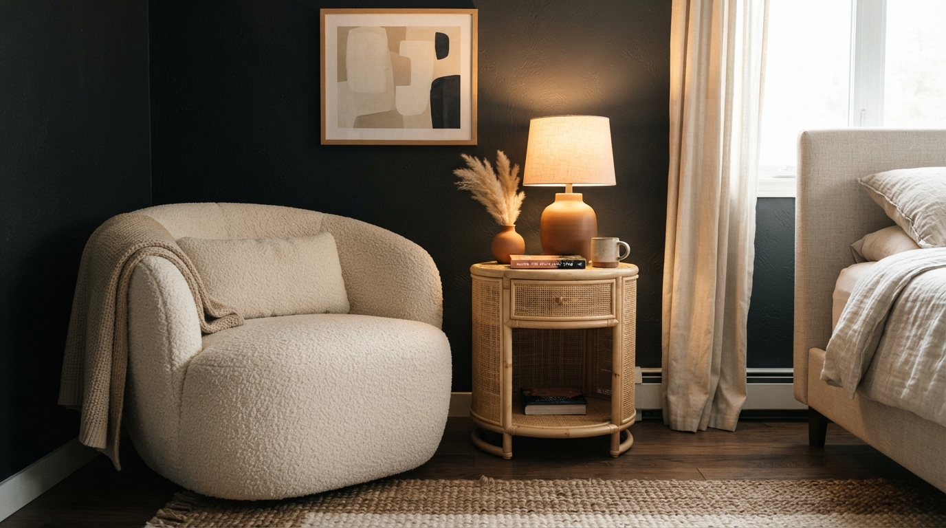
Dark wood furniture — walnut, espresso finishes — tends to disappear into a moody color palette a little too easily, so it’s worth introducing something lighter to break it up. A cream or oatmeal accent chair, a light rattan nightstand, or a pale area rug all create the contrast the room needs so it doesn’t read as one uninterrupted block of dark color.
Shape matters too. Rounded silhouettes tend to soften the overall feel, while sharp, angular furniture against dark walls can start to look severe. A curved headboard or a rounded side table goes a long way toward keeping the room feeling relaxed rather than stark.
9. Choosing Metal Finishes
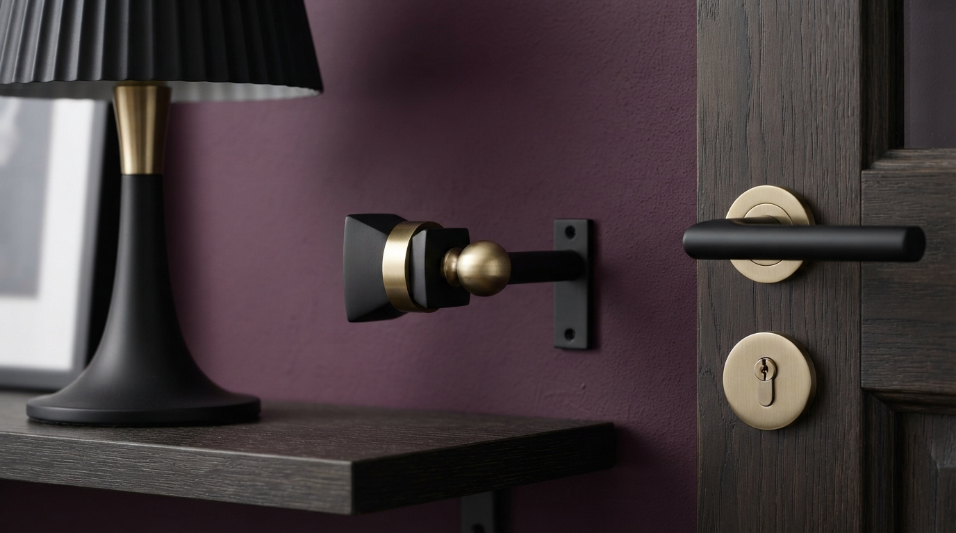
Matte black hardware — door handles, curtain rods, lamp bases — gives a moody room a clean, modern edge. Brass and antique gold do the opposite job, adding warmth and a slightly vintage character against deep walls.
There’s no rule that says you need to commit to just one. A matte black bed frame paired with brass lamp bases tends to look more deliberate and collected than sticking to a single finish throughout the room.
10. Making Moody Work in a Small Bedroom or Apartment
A small room with dark walls sounds like it shouldn’t work, but it often does — as long as you’re restrained everywhere else. Keep furniture low-profile, use a mirror or two to bounce light back into the space, and commit to one deep wall color instead of mixing several.
A single navy accent wall behind the bed, paired with white walls elsewhere and warm lamp light, can genuinely make a small room feel more purposeful than an all-white scheme did. A strong, deliberate focal point often reads as more spacious than a room with no clear anchor at all.
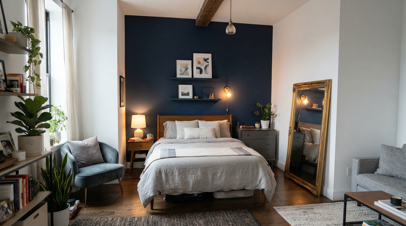
11. Doing This on a Budget
A full moody bedroom refresh doesn’t require a renovation budget. A can of good paint, a couple of secondhand textured cushions, and a warm-toned lamp picked up at a thrift shop can shift the entire feel of a room for well under a hundred dollars, depending on what you already own.
Paint first — it’s the cheapest change with the biggest visual payoff, and everything else (the chair, the throw, the lamp) can be added gradually as you find pieces you actually like.
12. Common Mistakes That Undercut the Look
A few missteps show up again and again:
- Painting every wall dark in a room that already gets very little natural light.
- Sticking with cool-white bulbs, which does more damage to the mood than the paint color ever could.
- Skipping texture and ending up with a flat, single-note room.
- Over-coordinating bedding and accessories until the room looks staged rather than lived-in.
- Leaving out any lighter element at all — no pale rug, no light curtain, nothing to break up the depth.
13. Documenting Your Own Transformation
If you’re planning your own before-and-after, take the “before” photo during the day and the “after” photo at night with the lamps on — that lighting contrast alone communicates the transformation better than almost any caption could.
A simple note like “before: builder beige and a single overhead bulb, after: charcoal walls and two warm lamps” does more to build trust with readers than a stock photo ever will.
14. Making the Room Feel Like Yours
Moody design isn’t really a formula you follow step by step — it’s closer to chasing a specific feeling. My own wall ended up green because I’ve always felt calmer around trees, and that particular shade quiets things down for me in a way I can’t fully explain. A friend chose navy for her room because it reminded her of a coastal trip, and she says it still gives her that same sense of distance from everything else every time she walks in.
Don’t try to finish the whole room in a single weekend. Pick one element — the wall, the rug, whatever you keep circling back to — and live with it for a week before adding the next piece. That’s genuinely how a lot of these rooms come together: one decision at a time, usually with at least one unplanned addition along the way.
FAQs
Does a dark bedroom affect sleep? If anything, it tends to help rather than hurt. Deep, muted tones combined with warm lighting generally feel calming rather than stimulating, which is part of why sleep-focused designers often lean toward darker palettes for bedrooms specifically.
What paint finish works best for a moody bedroom? Satin or eggshell. Matte finishes look beautiful in photos but absorb more light in person, which can make a smaller or dimmer room feel heavier than you intended.
Can I try this in a rental? Yes. Peel-and-stick wallpaper in a deep tone, combined with textiles and lighting changes, gets you most of the way there without touching the actual walls.
How do I keep a dark bedroom from feeling too heavy? Bring in warm lighting, add at least one lighter texture — a pale rug or cream linen — and keep the ceiling a lighter shade than the walls.
Is this style on its way out? It’s evolved rather than faded — less flat black, more deep jewel tones and warm neutrals — but the core combination of rich color and texture doesn’t show signs of going anywhere.